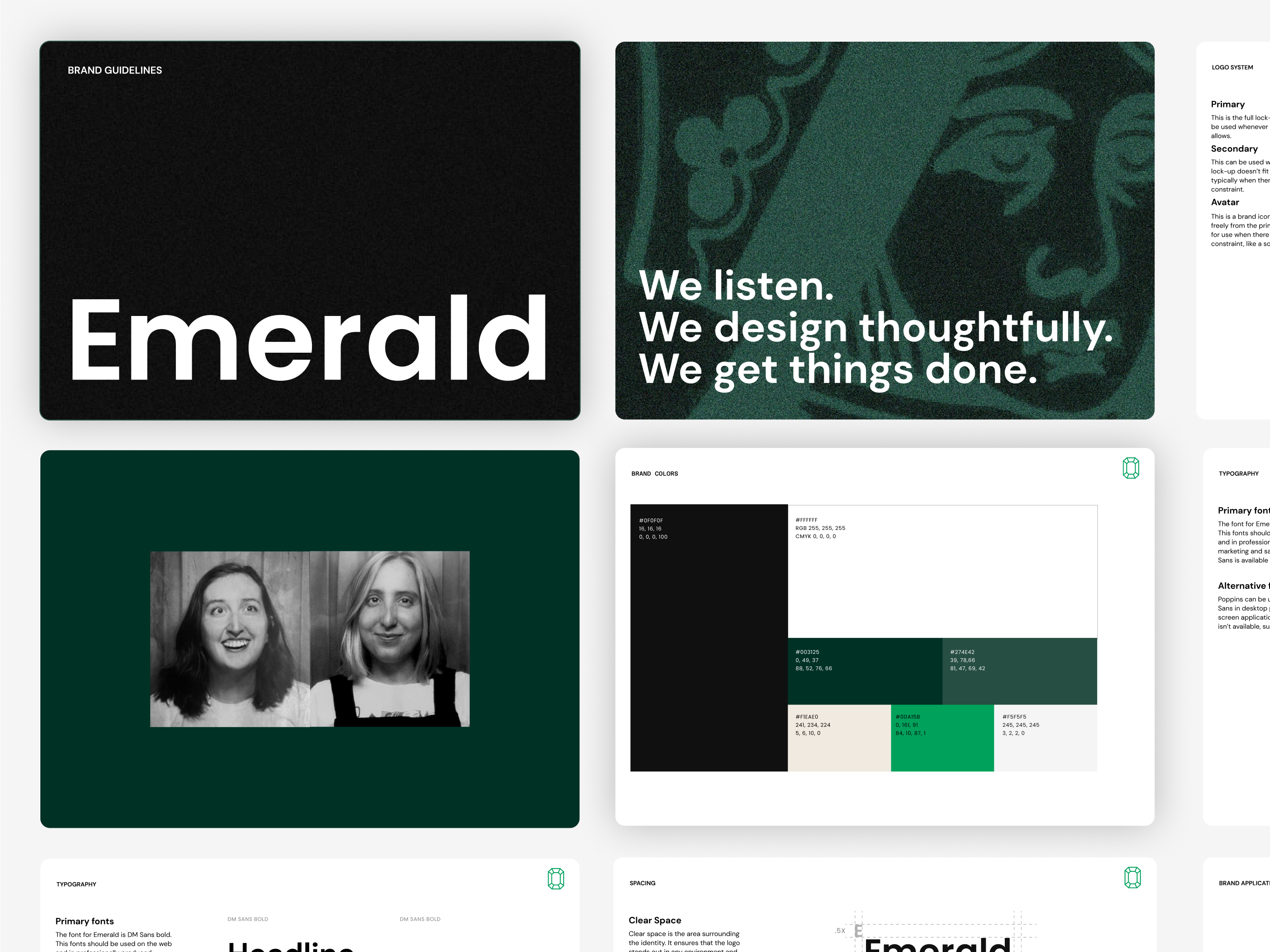
We used the same process we lead our clients through.
Let’s break it down.
We start with listening. We gathered insight into our brand, audience and reviewed existing materials through a discussion and through filling out our brand questionnaire. We answered questions like:
From this and additional discussion we distilled that into a creative brief. This outlines the company background, objective, target audience, tone and any unique characteristics.
Emerald is an innovative, impactful design studio that works collaboratively with big thinkers, dreamers and doers.
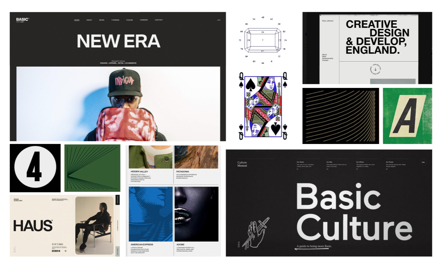
At this point we made a moodboard to visually guide us through building out the rest of the brand.
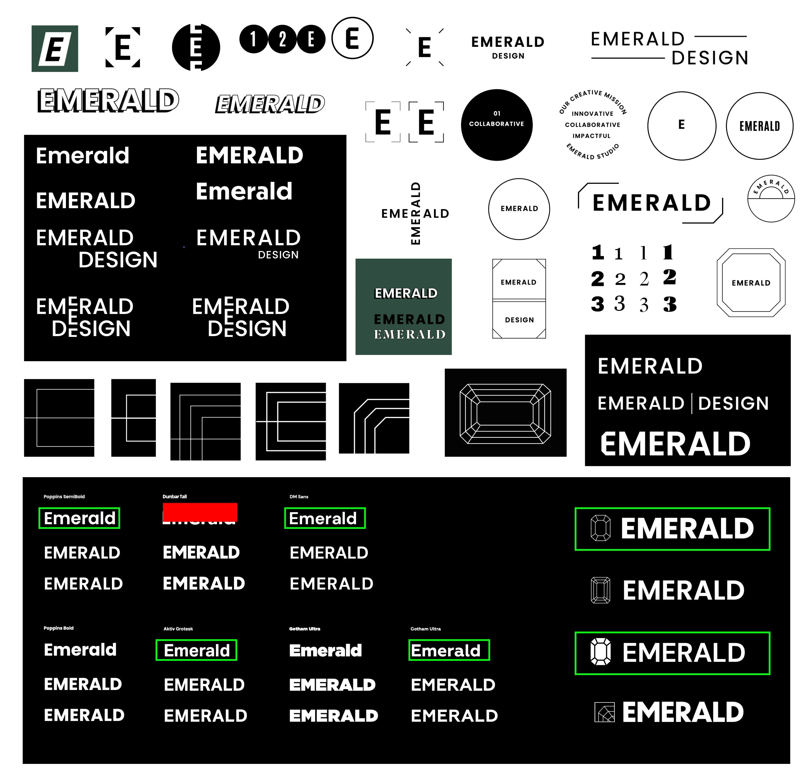
With the new brand positioning and visuals explored, we started to develop a logo system that fits the narrative and stands out in the space. As part of this process, we investigate a few options for different typefaces, look for opportunities to add small details for distinctiveness and look at any adjustments that need to be made to technical aspects of the mark.
Our process involves a lot of trial and error before we settle on a final direction. Here's a behind the scenes peek at what the middle of the process looks like.
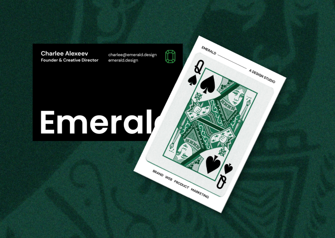
Then we applied our logo system & moodboard to different mockups to ensure it will work everywhere, from social media to business cards.
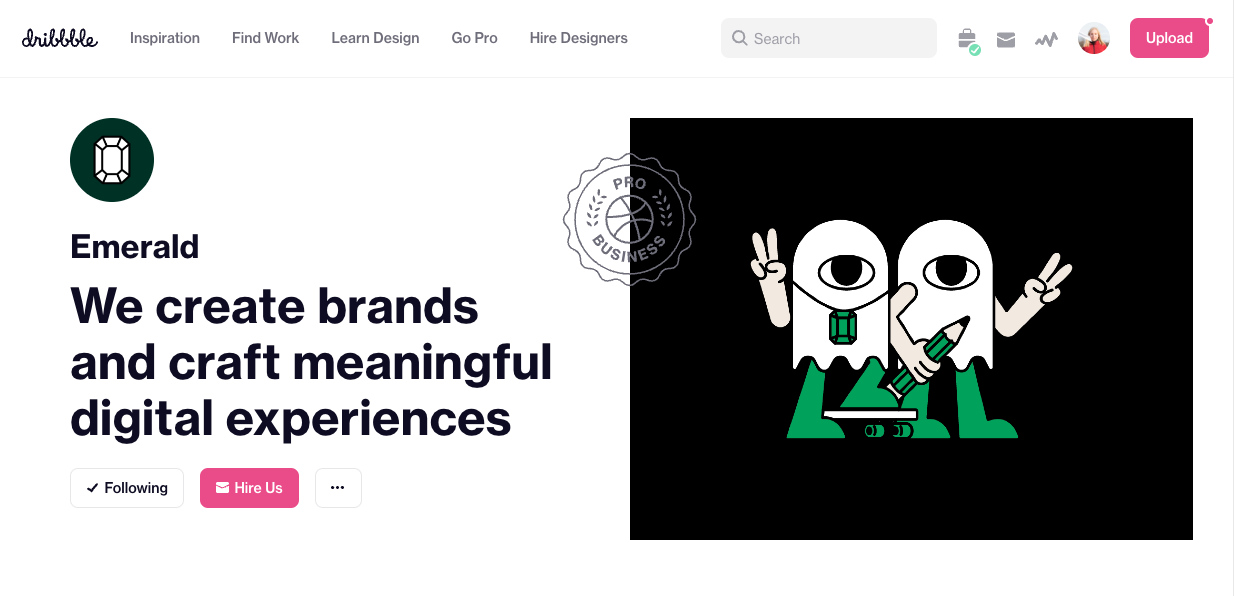
We tried to featuring twins or pairs wherever we could, a nod to our history of being mistaken for twins.
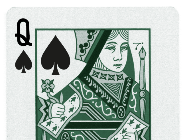
Our love of playing cards goes back to competing in a Euchre tournament together in college. We did not win, but we did have a good time! Look closely for some graphic design details woven into the illustration!
.gif)
As the final step in our process, we’ll provide brand elements and guidelines for future use. These guidelines will contain use of logo, color, typography, brand elements, prototypes and strategic positioning and serve as a foundation for the continual development of the brand over time.
